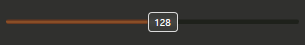
WPF 기본 Slider Stlye에서 Thumb을 드래그할 때마다 박스 안에 숫자가 표시되도록 Style 을 하였습니다.
Slider 모양
Style 추가
App.xaml 에 추가하거나 Resource.xaml 파일을 생성하여 Style 을 추가합니다.
1
2
3
4
5
6
7
8
9
10
11
12
13
14
15
16
17
18
19
20
21
22
23
24
25
26
27
28
29
30
31
32
33
34
35
36
37
38
39
40
41
42
43
44
45
46
47
48
49
50
51
52
53
54
55
56
57
58
59
60
61
62
63
64
65
66
67
68
69
70
71
72
73
74
75
76
77
78
79
80
81
82
83
84
85
86
87
88
89
90
91
92
| <SolidColorBrush x:Key="CustomSliderBackgroundSolidColorBrush" Color="#1E211B" />
<LinearGradientBrush x:Key="CustomSliderForegroundBrush" StartPoint="0,0" EndPoint="0,1">
<GradientStop Color="#65351F" Offset="0.2" />
<GradientStop Color="#9B5B2B" Offset="0.5" />
<GradientStop Color="#65351F" Offset="0.8" />
</LinearGradientBrush>
<LinearGradientBrush x:Key="CustomSliderThumBrush" StartPoint="0,0" EndPoint="0,1">
<GradientStop Color="#3B3C39" Offset="0.2" />
<GradientStop Color="#454543" Offset="0.5" />
<GradientStop Color="#3B3C39" Offset="0.8" />
</LinearGradientBrush>
<Style x:Key="CustomSliderThumbStyle" TargetType="{x:Type Thumb}">
<Setter Property="Focusable" Value="false"/>
<Setter Property="SnapsToDevicePixels" Value="true"/>
<Setter Property="OverridesDefaultStyle" Value="true"/>
<Setter Property="Height" Value="20"/>
<Setter Property="Width" Value="30"/>
<Setter Property="Cursor" Value="Hand"/>
<Setter Property="Template">
<Setter.Value>
<ControlTemplate TargetType="{x:Type Thumb}">
<Canvas SnapsToDevicePixels="true">
<Grid Height="20" Width="30">
<Rectangle x:Name="Background"
Fill="{StaticResource CustomSliderThumBrush}" Stroke="#FFDADADA"
Height="20" Width="30"
RadiusX="3" RadiusY="3"/>
<TextBlock HorizontalAlignment="Center" VerticalAlignment="Center"
Foreground="White" FontSize="10"
Text="{Binding Value, RelativeSource={RelativeSource AncestorType={x:Type Slider}}}"/>
</Grid>
</Canvas>
<ControlTemplate.Triggers>
<Trigger Property="IsMouseOver" Value="true">
<Setter Property="Fill" TargetName="Background" Value="Orange"/>
</Trigger>
<Trigger Property="IsDragging" Value="true">
<Setter Property="Fill" TargetName="Background" Value="{StaticResource CustomSliderThumBrush}"/>
</Trigger>
<Trigger Property="IsEnabled" Value="false">
<Setter Property="Fill" TargetName="Background" Value="Gray"/>
</Trigger>
</ControlTemplate.Triggers>
</ControlTemplate>
</Setter.Value>
</Setter>
</Style>
<ControlTemplate x:Key="CustomSliderControlTemplate" TargetType="{x:Type Slider}">
<Border Background="Transparent" SnapsToDevicePixels="True">
<Grid>
<Grid.RowDefinitions>
<RowDefinition Height="{TemplateBinding MinHeight}" />
</Grid.RowDefinitions>
<DockPanel LastChildFill="True">
<Border x:Name="PART_SelectionRange" Height="5" ClipToBounds="True" Visibility="Visible">
<Rectangle Margin="0 0 -10 0" RadiusX="2" RadiusY="2" Fill="{StaticResource CustomSliderForegroundBrush}" />
</Border>
<Border ClipToBounds="True" Height="5" Visibility="Visible">
<Rectangle Margin="0 0 0 0" RadiusX="2" RadiusY="2" Fill="{StaticResource CustomSliderBackgroundSolidColorBrush}" />
</Border>
</DockPanel>
<Track x:Name="PART_Track">
<Track.Thumb>
<Thumb Style="{StaticResource CustomSliderThumbStyle}" VerticalAlignment="Center"
Width="{TemplateBinding MinWidth}" Height="{TemplateBinding MinHeight}" OverridesDefaultStyle="True" Focusable="False" />
</Track.Thumb>
</Track>
</Grid>
</Border>
</ControlTemplate>
<Style x:Key="CustomSliderStyle" TargetType="{x:Type Slider}">
<Setter Property="Template" Value="{StaticResource CustomSliderControlTemplate}" />
<Setter Property="VerticalAlignment" Value="Center" />
<Setter Property="MinWidth" Value="30" />
<Setter Property="MinHeight" Value="20" />
<Setter Property="Height" Value="20" />
<Setter Property="MaxHeight" Value="20" />
<Setter Property="BorderBrush" Value="Transparent" />
<Setter Property="Background" Value="Transparent" />
<Setter Property="AutoToolTipPlacement" Value="None" />
<Setter Property="IsMoveToPointEnabled" Value="True" />
<Setter Property="SelectionStart" Value="0" />
<Setter Property="SelectionEnd" Value="{Binding Path=Value, RelativeSource={RelativeSource Self}}" />
<Setter Property="Stylus.IsPressAndHoldEnabled" Value="false" />
</Style>
|
Slider Style 적용
다음과 같이 Slider 에 Style을 지정합니다.
1
| <Slider Minimum="1" Maximum="255" IsSnapToTickEnabled="True" Style="{StaticResource CustomSliderStyle}"/>
|